Kay Witherspoon
MA, SAA, AAEA – INSTRUCTOR
Announcements:
At the start of 2018, our class painting (optional, of course) will focus on sunsets, their radiant colors, glazing, contrasts, atmospheric techniques, etc.
*Please bring your sketch notebooks and a couple of inexpensive canvas panels for practicing color mixtures and brush techniques.
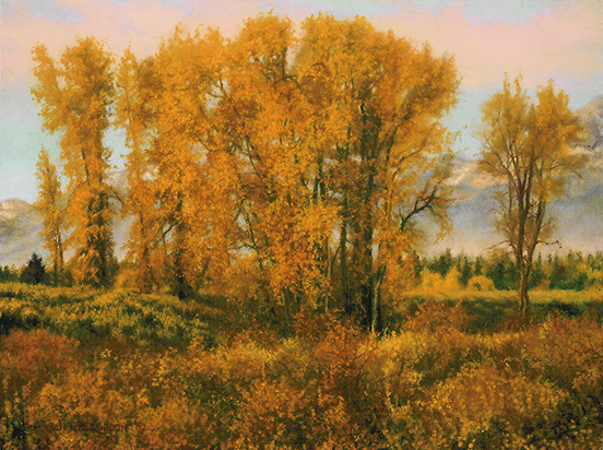
Lost In Space: Add depth to your landscapes with linear and aerial perspective
As a realist, you want to make landscapes look real. This means conjuring up an illusion of depth that gives viewers the feeling they could stroll right into the scene. Without this illusion, the painting looks flat and uninviting.
Two Types of Perspective
The viewer of a painting is visually handicapped in that the flat canvas does not allow for stereoscopic, multidimensional vision. Thus the painter is required to “push” the illusion of depth.
1. Linear Perspective: AKA Geometric Perspective – this includes vanishing points; one, two, and three-point perspective; and horizon lines. The tools are:
Overlapping objects = the positioning of shapes.
Scale = The size of an object diminishes with distance, as with telephone poles in a receding row. Just include familiar objects of similar actual size so that diminution makes sense.
2. Aerial Perspective: AKA Atmospheric Perspective – this has to do with how the air between us and an object affects our perception of the object’s color, value, temperature, and chroma. This is a product of natural laws.
Air scatters light, and any dust or moisture suspended in the air increases the scattering. This scattering us responsible for most of the atmospheric effects we see. The more air we see, the more pronounced the effects are.
Contrast = decreases with distance. Some of the scattered light spills into dark areas or may even be bounced back to the viewer, making the dark areas seem lighter. The effect isn’t as apparent with light areas.
Sharp Edges = decreases with distance. An edge is defined as a value contrast between two adjacent shapes, and the sharper the contrast, the sharper the edge. Because contrast decreases with distance, the edges, being dependent on contrast, seem to become softer (blurred, flared, scumbled). Because contrast decreases with distance the edges,, being dependent on contrast, seem to become softer.
Color – Scattered sky light is a low-chroma blue, and that sky light affects the color of objects it falls upon.
Temperature – Color temperature decreases with distance. The scattered blue sky light shifts colors to the cooler end of the spectrum.
Chroma (Richness) – decreases with distance. Scattered blue light isn’t a high-chroma blue. The blue, instead, is mixed with white light (other color), thus lowering its chroma. This “impure”, “tinted”, “muted” light is what decreases the saturation of all colors in the landscape. At infinity, color is completely desaturated. This “impure” light is what decreases the saturation of all colors in the landscape. At infinity, one can expect the color to become completely desaturated.
Additional clues:
Detail – (also, Texture) diminishes with distance. With a grassy field, the foreground may show individual stalks while the background grasses merge into larger masses. Also, a subtle “eye path” can be an effective clue to receding distance.
Don’t let your viewer get “Lost in Space”. Include or exaggerate their effects so visual depth is clearly conveyed.
As the Autumn season approaches we will have short programs at the beginning of class on fall colors.
1) ORANGE – Wed., Aug. 23 at 6pm & Thurs., Aug. 24 at 9:30am
*Please bring your sketch notebooks and download the attachment on “Orange” from your 8/20/17 email.
When deepened, orange – unlike red and yellow – becomes brighter instead of darker. Few colorants produce pure orange. During the Middle Ages, orange mineral provided a rich, opaque pigment for easel painting and illuminated manuscripts.
Near the end of the 18th century, the emerging commercial paint industry developed synthetic iron oxides, “Mars Colors,” which made more predictable colors than natural earth pigments. Used for color consistency and opacity, Mars colors range from orange to dark red/purple. Today, painters have several orange options. Painters like Wolf Kahn reach for Gamblin Transparent Orange, a warm color unique to the Gamblin palette.
Orange is the color of safety: orange life vests are easily seen on dark and stormy seas. Always a warm advancing color, orange is the forerunner of the sun.
During the Middle Ages, orange mineral, also called minium, provided a rich and opaque pigment that was used in easel painting and illuminated manuscripts. It was made by prolonged heating of white lead over an open fire. Noticeably toxic, Chinese bookmakers painted the edges of paper with orange mineral to save their books from silverfish. Orpiment, an extremely poisonous sulfide of arsenic, was mined as a yellow to reddish-yellow pigment. Its noxious sulfur fumes and highly reactive properties made orpiment a color of last choice. Realgar, another poisonous pigment found in the earth, made a better orange, but it was incompatible with lead or copper-based pigments.
Cadmium Orange was the first true orange. It is a pure hue with excellent opacity and low toxicity compared to its predecessors. Around 1820, yellow cadmium sulfide was discovered as an impurity in the processing of zinc ores. The name cadmium is derived from cadmia fornacum, a type of furnace used to smelt zinc. In experiments, chemists used hydrogen sulfide to precipitate the yellow colorant from solutions of cadmium salts. By 1880, they further discovered by gradually increasing the amount of selenium, they could produce deeper shades of cadmium orange and all shades of cadmium red.